Silver Queens Cover Art
Yesterday I received the final files from Leanna Crossan for the Amelia Sand and the Silver Queens cover.
Short version: I love it, and I’ve been happily tweaking away at text and layout. I’m now to the point where I can’t really see it anymore, which means it’s time to share and see what you think.
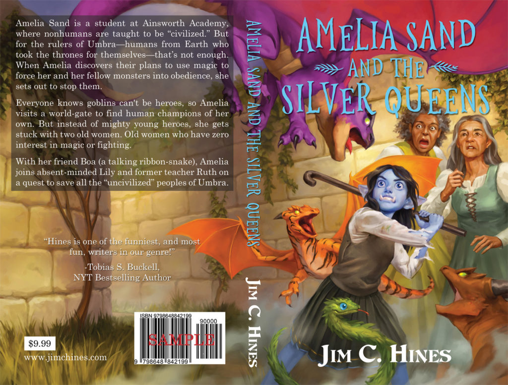
Here’s the full layout, which will be used for the paperback. (And as I upload the image, I can already see that I want to move that quote from Tobias Buckell a tiny bit higher so it will be centered between the bar code and the text block.)
The price is not final. That’s going to depend on what the costs are. I’m not going for a huge royalty on the print copies, but I do need to be able to feed the cat and the dog. Oh, and the kids too, I suppose.
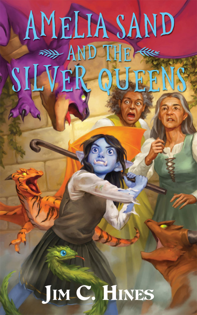
Here’s the front cover, give or take a few pixels on the dimensions, that will be used for the ebooks and online.
So… What do you think? Any suggestions before I finalize this sucker?


mg
August 17, 2023 @ 4:34 pm
Love it!
ta
August 17, 2023 @ 6:43 pm
I really like it.
I fully admit to the fact that I’m currently wearing the wrong glasses for this, but even if I do the “slide them up and down my nose” trick, the font used for your name makes it look like “JiY” to me. Complicating things, I’m learning a language that uses Y and y to represent different vowels, so I am probably just weirdly primed for it. Everything else reads just fine–it’s just the M.
So it’s not a reason by itself to change it, but if you were already waffling on that particular font, it might be an interesting data point. (And if you weren’t, now you have a weird story to tell about it.)
hil
August 17, 2023 @ 11:11 pm
Looks great! Congrats on getting to the final stages of the project!
I wonder if the title could be a little higher up? It strikes me that it covers a bit much of the taller woman’s head and the purple dragon’s face. Perhaps the “AND THE” could be a little smaller?
Booji Boy
August 18, 2023 @ 1:13 am
The title text (cover and spine) doesn’t pop for my eyes and I think it’ll be hard for some color blind people. One way to check is to view it in gray scale.
It contrasts mainly by hue. Suggest making it contrast by one more characteristic (lightness, saturation, border, shadow, etc.).
Still, a very beautiful cover! ♥️
Kris B
August 18, 2023 @ 11:51 am
I am also not a fan of the typeface for your name, more because it’s too close in feel to the title display font. Basic rule when mixing typefaces is one serif/one sans serif, both of these are mildly serifed. I would try a sans serif for your name – a heavy weight of Stone Sans might do the trick. Anyway … two cents from your friendly, neighborhood typographer. LOVE the illustration, which I think sells the story just fine. Dragons! Grey-haired women! woohoo
Jim C. Hines
August 18, 2023 @ 2:35 pm
Thanks, all! I’m tweaking at things a bit more based on feedback here and elsewhere. It’s very much appreciated!
Jeanine
August 26, 2023 @ 10:30 am
I am late to the party so don’t know if my comment is in time to be of any value. However, here it is just in case. The artwork is delightful! Looking forward to getting a copy(or three)! Only one very very minor quibble. I am not 100% sold on the appearance of the title since the word Sand is rising upward and it doesn’t look entirely intentional, at least at first glance. Perhaps bringing the D down sharply would help or perhaps making the waviness in the entire title a bit more exaggerated would help?